
Using a XV century painting, we explore how AI can act as a translation device for economists, moving between paintings and mechanisms, models and images, equations and questions others can see. But it also prompts more general reflections, about bridging across disciplinary silos, and the future of the economic profession.
A museum experiment
After a week of meetings, talks, and discussions at a central bank, a few colleagues and I did what economists apparently do when they try to take a break: we went to a museum, and kept talking about papers. Papers to revise; papers to submit; new papers that should exist. And, inevitably, the effect artificial intelligence will have on our profession.
The obvious question was whether AI will make our work faster: summarising papers, drafting referee reports, searching the literature, writing code, or preparing slides. Those uses matter. But in the museum a different question became more interesting. Could AI help us move across forms of knowledge economists rarely connect? Could it translate between the visual language of art and the formal language of economic models?
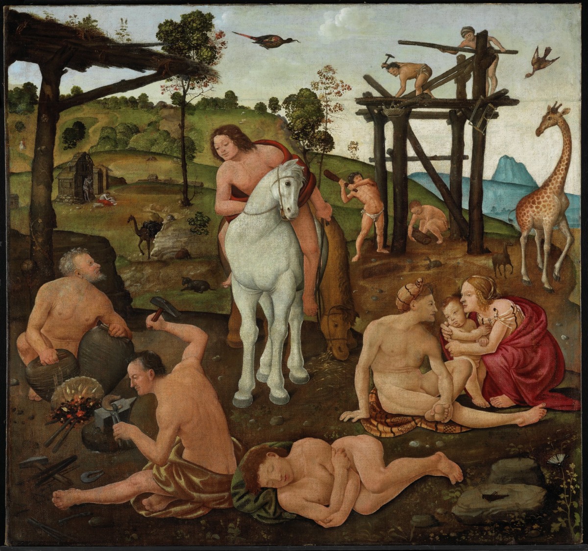
So we tried a small experiment. We took Piero di Cosimo’s An Allegory of Civilization, c. 1490, and asked an AI system to read it as the seed of an economics paper. The exercise was playful, closer to a provocation than to art history or a journal submission: what changes when a painting is treated as a model? But we will return to its meaning in the concluding section.
A painting as a model
The painting is a Renaissance meditation on the beginning of civilisation. It shows fire, metalworking, building, animals, a sleeping figure, and figures moving between nature, myth, and organised life. The AI immediately mapped these elements into economic terms. Fire and metallurgy became foundational technologies. The sleeping figure became a state of dormant potential. Building activity became social organisation and division of labour. The movement from natural life to organised community became a transition from stagnation to self-sustaining growth.
The output, if taken literally, was amusing. It sketched an imaginary paper on technology adoption, coordination, and the awakening of economic growth. The mechanism was a threshold: below it, no individual has enough reason to adopt; above it, spillovers, complementarities, and imitation make adoption privately attractive and socially self-reinforcing. In other words, it translated a Renaissance scene into the grammar of growth theory.
The model itself is familiar: increasing returns, spillovers, coordination problems, and the transition from a low-productivity equilibrium to a more productive one. The surprise was the mapping: the forge, the sleeping body, and the unfinished construction had been turned into the parts of a growth model. The figures around the forge became adopters of foundational technologies. The sleeping body became an economy before take-off.
That is a useful reminder for economists. Models often begin before mathematics: with a way of seeing a constraint, a trade-off, a threshold, or a strategic interaction, and only then with a decision about whether formalisation is worthwhile. A painting can make those primitives visible. It can show simultaneity, hierarchy, transition, and tension in ways prose sometimes cannot. In this experiment, AI was less an author than a translator between perceptual intuition and analytical structure.
A model as a painting
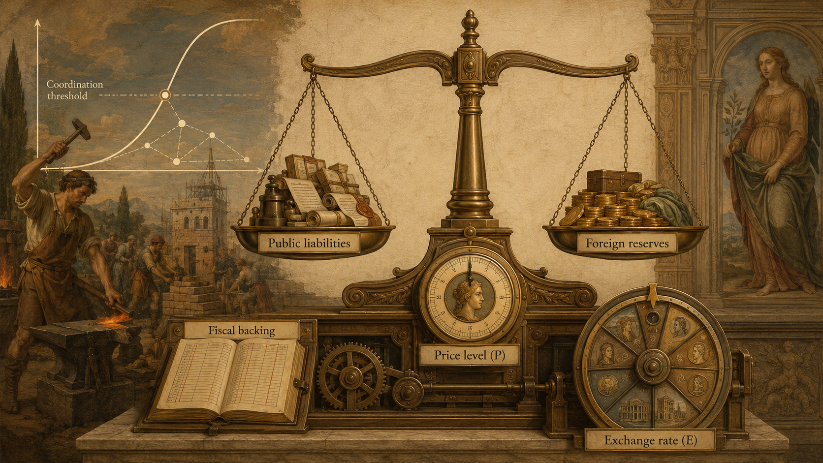
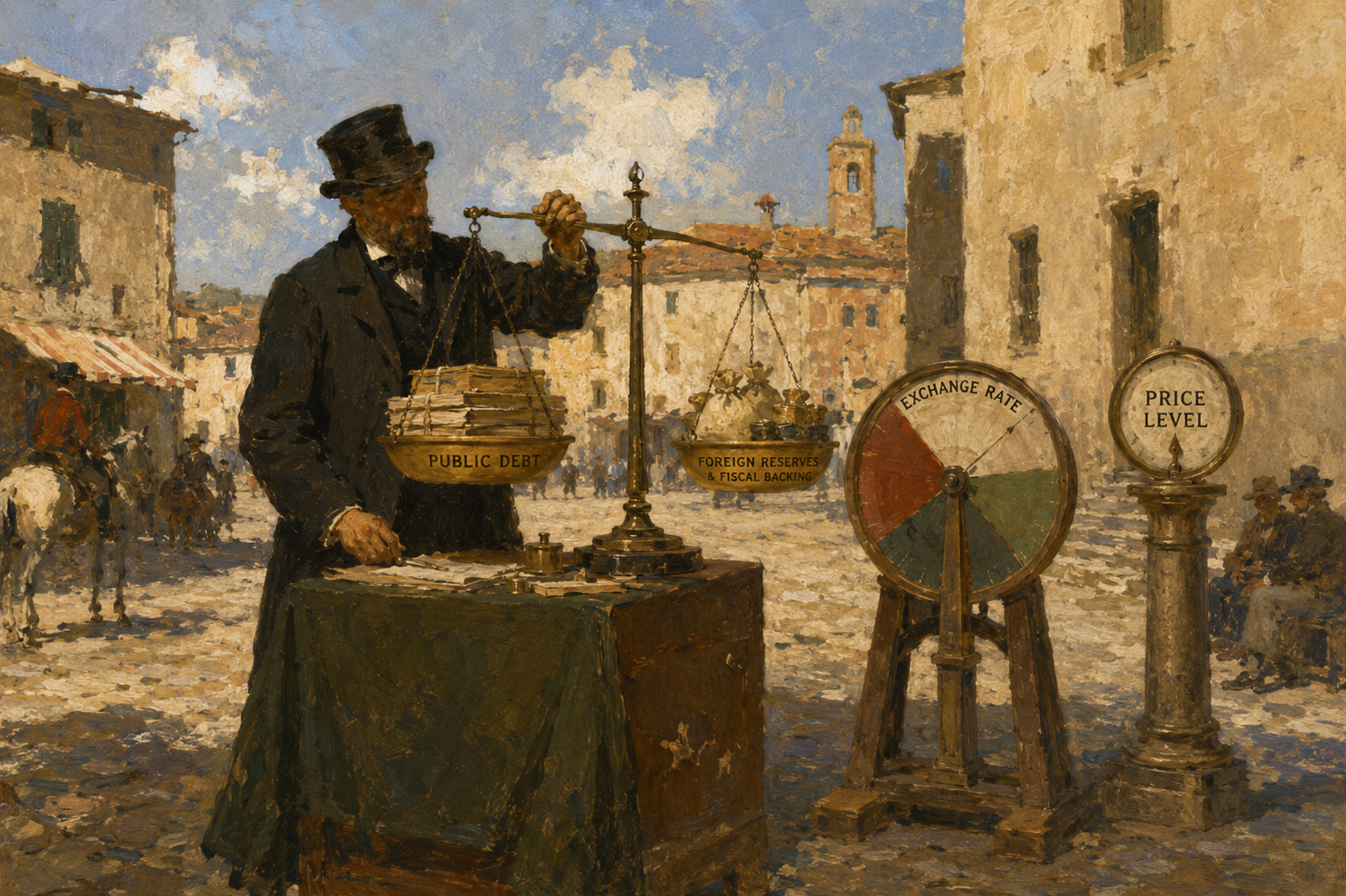
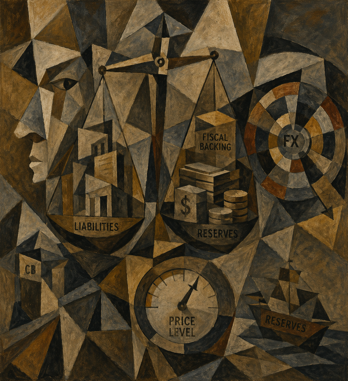
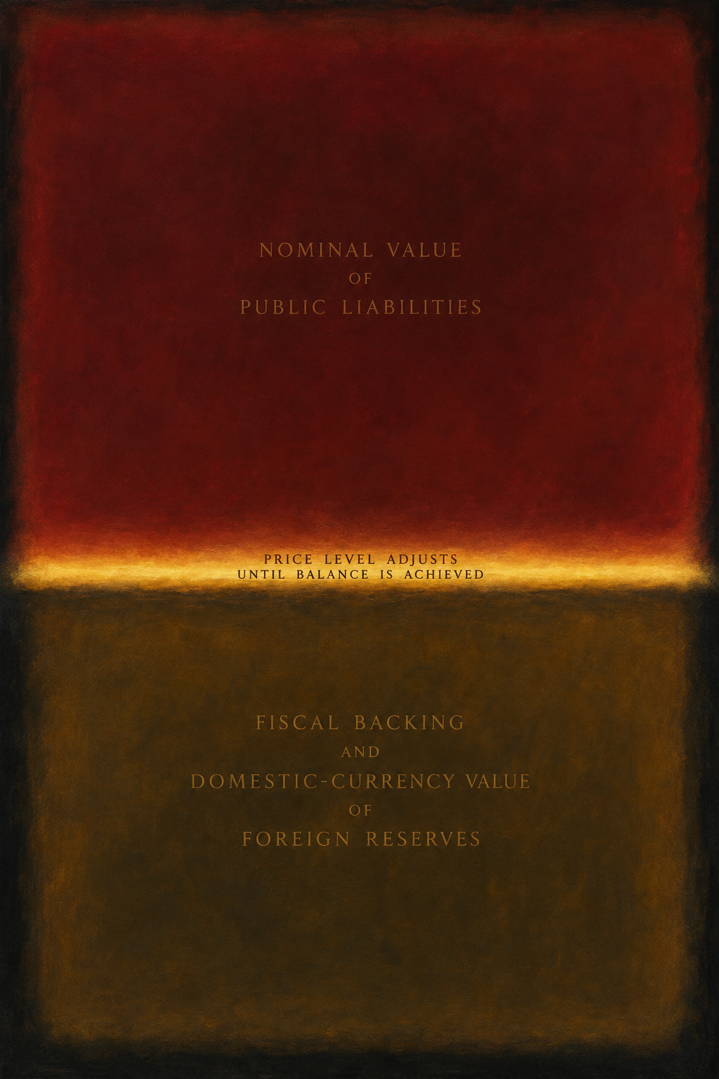
But then, we had the idea of running the experiment in the opposite direction, from economics to art. I had written a simple paper on the Fiscal Theory of the Price Level, drafting an approach to international reserve management inspired by John Cochrane. So I asked ChatGPT to paint it. In plain terms, the theory says the overall price level is whatever it must be to keep the government's debts in line with its ability to repay them. If the government runs excessive deficits, higher prices reduce the real value of debt. Accumulating international reserves while at the same time issuing nominal bonds in domestic currency increases the tax base that inflation can devalue. The AI staged this as an allegory: a balance scale holding public liabilities against fiscal backing and the domestic-currency value of foreign reserves, a treasury figure keeping the ledger, an exchange-rate wheel, and a price-level dial. The whole apparatus is set beside the coordination-threshold motif from the museum experiment.
Again, the result was a sketch of the model. Still, it put into view something that economic exposition can easily bury. A balance-sheet model is already visual: assets, liabilities, valuation channels, and variables that move to close an accounting relation. Translating the Fiscal Theory of the Price Level into an allegory forced the model's architecture into view: what balances what, which variable adjusts, which authority provides fiscal backing, and how, in that argument, reserves can stabilise fiscal shocks while also transmitting foreign nominal shocks through reserve valuation
For economists, the value goes beyond decoration. A good visual metaphor can clarify the mechanism before it simplifies the mathematics. It can help students, policymakers, and colleagues outside a narrow field see where equilibrium is imposed, which price adjusts, and which balance-sheet item carries the shock. It can also expose weaknesses. If a model resists visual description entirely, perhaps its intuition deserves another pass. If the image is too easy, perhaps the model is a familiar story in new notation.
Caveats
The risks are visible in the experiment itself. Here is the key caveat: AI can make analogies too quickly. It will happily make the giraffe, the forge, the ledger, and the wheel all mean something, even when the interpretation is unearned. It can mistake ornament for mechanism. It can produce confidence without judgement (Alas, none of this happened in the experiment!). The economist's task is interrogation: which analogy is substantive, which is superficial, and which should be discarded?
That judgement remains human. In the museum exercise, the AI's mock journal prose and claims about civilisation mattered less than the bridges between visual detail and economic mechanism: fire as technology, sleep as latency, construction as coordination, the scale as an equilibrium condition, the exchange-rate wheel as a valuation channel. Some metaphors were immediate, even banal. Then again, we should be humble: some of our own work may be subject to a similar judgement. A few were genuinely clarifying.
One practical lesson is perhaps modest, but hardly irrelevant. AI belongs beside economic thinking, under the economist's judgement. It can change the questions we ask before formalisation begins. What is the mechanism? What is the image behind the equation? What would this model look like if one had to paint it? And what economic structure is already present in the images that surround us? By the way, many seminars now include AI generated images in the first few slides---although not going back to Piero di Cosimo’s An Allegory of Civilization.
Some reflections to conclude
A morning at the museum produced neither a new growth paper nor a new theory of reserves. It was not meant to. A way to appreciate the experiment is as follows: through one painting and one macro model, it reminded us that economists also choose the language in which a mechanism can be seen.
There are also other ways to appreciate it, however. The museum experiment matters because academic life rewards specialisation. We build careers inside fields, methods, and journal conversations. That specialisation is necessary for our careers, but it can narrow the metaphors available to us, and most importantly, it prevents the dialogue with other disciplines. Living in silos limits our views and grasp of the problem we tackle---clearly linked to technology, sociology, political science, law, anthropology and neuroscience, to list a few obvious links. The costs of bridging across disciplines are high, the reward often negative, as it generates scepticism about one’s disciplinary rigour and focus.
AI offers no automatic solution. Left on autopilot, it may simply reproduce the common phrases of each silo. Another view is that, pressed against a painting, a model, or a public explanation, it can sometimes force movement between languages. Or it may do more. We believe it is worth trying to push the envelope.
Finally, many young economists now face the following issue: what once was hard-won competence in writing models and code, rewarded with positions and publications, is becoming less scarce. It takes a few minutes in an AI interface to have a model run, the results tabulated the right way, and the graph nicely laid out. In office hours, a supervisor's comment that once would have requested a few weeks of work can now be addressed in minutes, before the meeting ends. What does this mean for the profession? A sense of uneasiness, and an urgency to tackle this issue, is now part of our daily routines.
The AI experiment is no answer, but it arguably provides some food for thought. As a profession, we can raise our ambitions, spending more time on conceptual and general issues, digging more intensively into data generation and big data, focusing more on the way people form their beliefs and interact with each other, and enhancing our communication and outreach. The question is to what extent AI will be an enabler for our profession, creating space for the many smart researchers at the beginning of their careers.
Alternative visual treatments
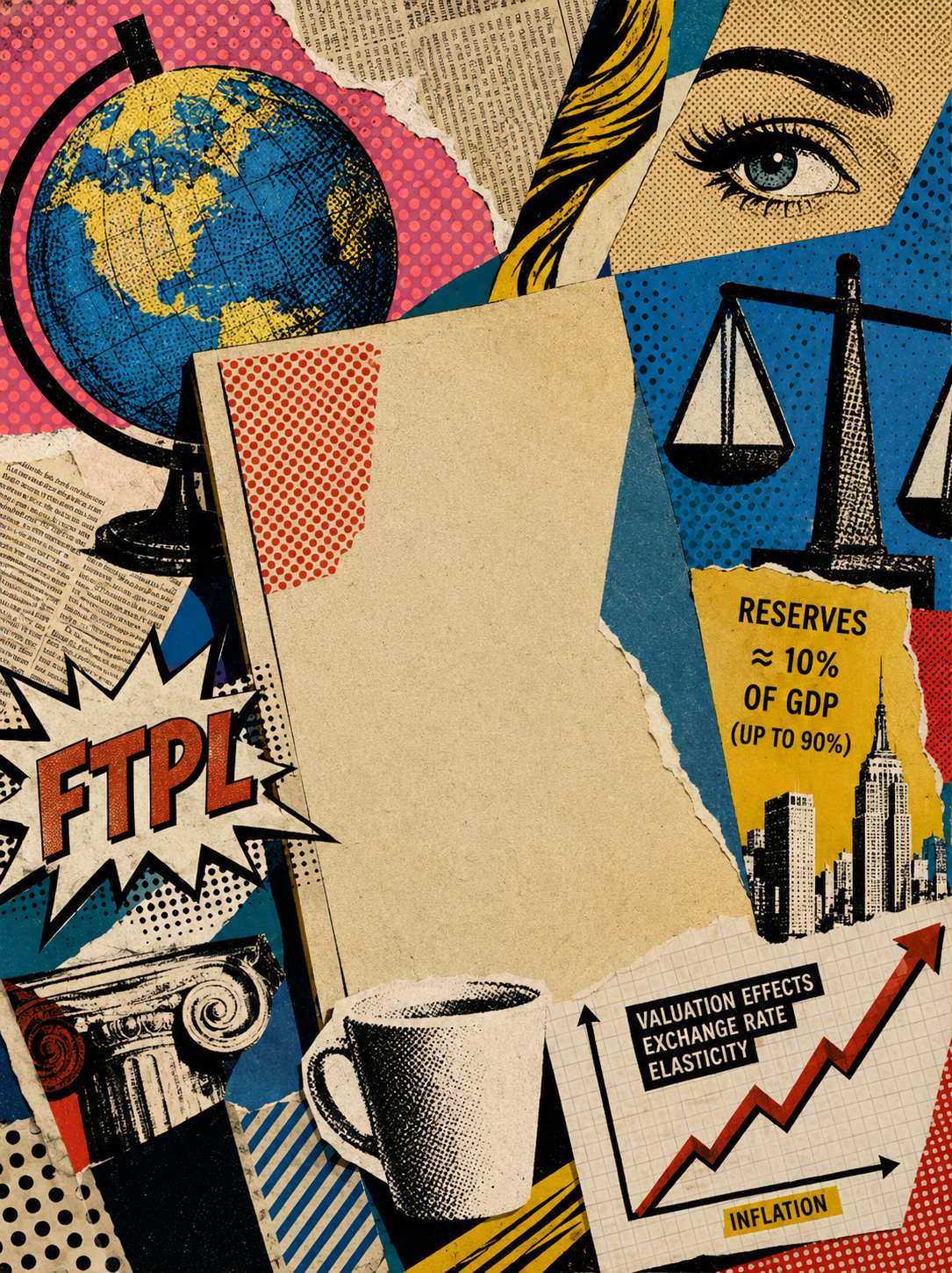
We played with the metaphor. We asked AI to produce painting in the style of pop art, macchiaioli, cubists and why not, Mark Rothko, inspired by the exhibit currently in Florence:
Authors: Giancarlo Corsetti with Pedro Salgado
Source page: Piero di Cosimo, An Allegory of Civilisation, c. 1490, National Gallery of Canada: https://www.gallery.ca/collection/artwork/an-allegory-of-civilization.